
Overview
Project intake
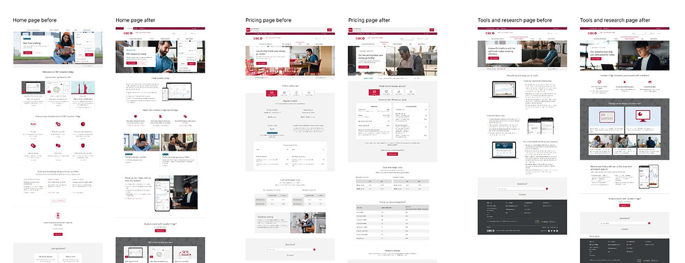
CIBC Investor's Edge business aimed to update essential website pages to match a fresh campaign style. (2023)
My role
UX designer: researched and designed the wireframe experience for the site's key new pages.
Timeline
Total project time was 2 months, design timeline was 2.5 weeks, 1 week of research and understanding.
Project goal
Increase conversions
CTA click-through rate
01
Increase engagement
Reduce bounce rate
Client satisfaction
02
Increase organic traffic
Search engine traffic
Internal eco-system traffic
03
Other requirements:
-
Refresh the key 5 pages of Investor's Edge website to align with the new look and feel in the media per [removed agency name] creative brand guidelines
-
Readjust the audience group to attract more Millennials and Gen Z investors
-
Make Investor’s Edge website look more modern


How might we assist our clients in making informed decisions about the investment product they are seeking?
Research
To pinpoint the opportunity and align with our goal and KPI, we undertook the following steps.

What are our potential user looking for?
-
Administered a brief user survey to understand client priorities
-
Conducted literature review to understand what young investors care about
What are our current client interested in?
-
Analyzed activity map data to identify our clients' primary interests to help prioritize content
-
Assembled Adobe Analytics dashboards to comprehend page traffic and entry points
What are our potential user searching for?
Analyzed SEO report to identify opportunities to increase page traffic from search engine
How do we increase conversion?
Conducted competitive analysis to understand the industry trends and identify competitive opportunities
What are some design opportunities?
-
Discover UX opportunities through heuristic evaluation of the pages.
-
Identify content and visual opportunities in collaboration with content, visual designers and the product team.
Finding summary
Our user: Millennials and Gen Z
-
Digitally savvy - mobile first
-
Prefer simply and clear info - quick and easy
-
Most are interested in: stock, crypto, TFSA, ETFs
-
Interested in general money growth and saving for a goal
-
Always looking for educational content, help and support
Lack of trust and confidence
Disconnection between advertising and actual website.
Lack of interest
Website was lacking overall visual elements to help user breakdown content section and spark visual interest.
User journey

Others

Product over account type
Most people care about investment product more than the type of accounts.
Top investment interests
People care more about stable ans secured growth, low fees, and transaction time.

Company value
Among younger investors, they care more about who they are investing with.
Educational
Most people are looking for educational information or guidance.

Help and support
Regardless of investment knowledge, people are looking for good help and support option.
Visual
People responded well to competitors with more visual elements on page.
Wireframe direction
Informed by our research findings, we've established the following key elements for the new wireframe design.
Relevant and timely
Provide contextual, relevant, short-to-the-point information during decision making.Give prospect clients all they need to know to make the decision of becoming a client faster.
Call-to-action visibility
Improve visibility of conversion CTA, attract visual attention to prompt desired action
Supportive voice of tone
Change voice and tone to be more caring and supportive. Younger investors want to know that organizations care about them and the world we live in.
Visual appearance
Improve overall visual design. Sparks visual interest while users are engaging with our pages, like WealthSimple which through user testing people responded the best to.
Key design decisions


Results
20.42%
Traffic increased on "getting started" page
16.30%
Traffic increased on "account" page
10.92%
Traffic increase on landing page
4%
Reduced overall bounce rate
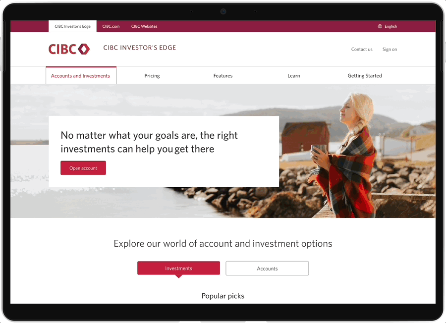
Wireframe example
As the UX designer for this project, my role focuses solely on crafting the overall flow and information structure. Detailed content and visual design tasks are handled by the content and visual designers after the wireframe phase.

Visual example
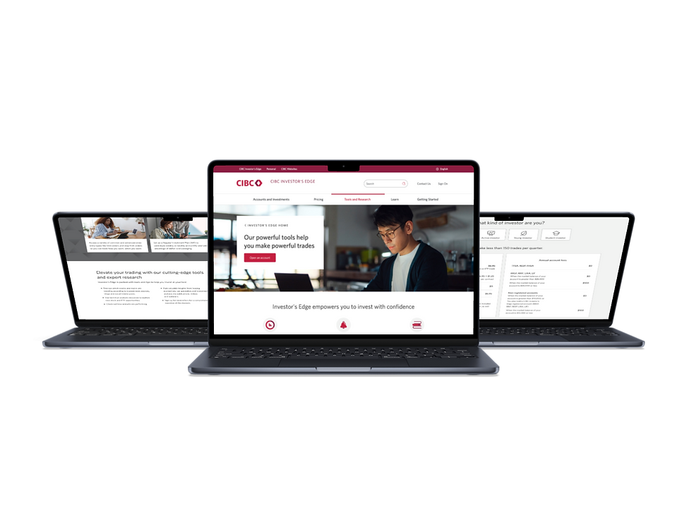
Design - live page links
Challenges
Limited access to business data
The product team had no access to some key metrics such as conversion rate to measure success. Created adobe analytic dashboard to track what I can.
Conflict changes to the same pages at the same time as we were launching
Triple confirm, communication, be ready to workout solution on the go.
Timeline did not allow user testing
Work closely with project manager and UX researcher to coordinate possible options. Managed to fit in one survey to gain some insights while working in parallel.